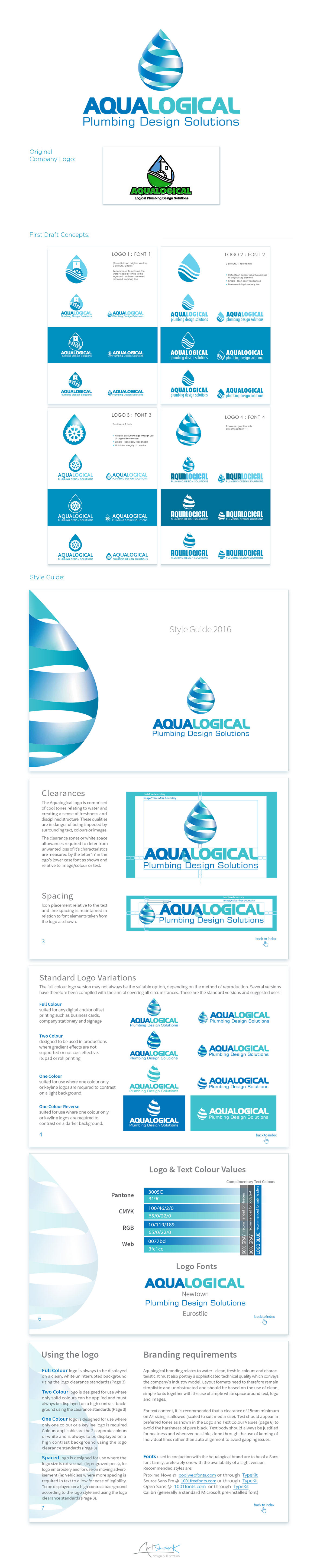
Aqualogical is an existing company who asked for re-design of their logo and a basic style guide for their new branding. They originally asked I not divert too far from their previous logo for fear of existing clients not recognising the brand but were wanting a fresher, more contemporary look. I initially offered the client 4 draft concepts, each shown with 4 chosen font options. Concept 4 was in fact a 'ring in' which i threw into the mix at the last minute as something totally different. Strangely enough it was immediately the preferred design using the fresher colours from one of the latter options. The Style Guide is in pdf format with all pages linked to the index on page 2 (not shown here) for ease of navigation. As the company already uses its preferred designer and printers for all other medias, I included live font resource links in the guide to make life easier for everyone :)